Shodan: The scariest search engine on the Internet By David Goldman
"When people don't see stuff on Google, they think no one can find it. That's not true."
That's according to John Matherly, creator of Shodan, the scariest search engine on the Internet.
Unlike Google, which crawls the Web looking for websites, Shodan navigates the Internet's back channels. It's a kind of "dark" Google, looking for the servers, webcams, printers, routers and all the other stuff that is connected to and makes up the Internet.
Shodan runs 24/7 and collects information on about 500 million connected devices and services each month.
It's stunning what can be found with a simple search on Shodan. Countless traffic lights,security cameras, home automation devices and heating systems are connected to the Internet and easy to spot.
Shodan searchers have found control systems for a water park, a gas station, a hotel wine cooler and a crematorium. Cybersecurity researchers have even located command and control systems for nuclear power plants and a particle-accelerating cyclotron by using Shodan.
What's really noteworthy about Shodan's ability to find all of this -- and what makes Shodan so scary -- is that very few of those devices have any kind of security built into them.
"It's a massive security failure," said HD Moore, chief security officer of Rapid 7, who operates a private version of a Shodan-like database for his own research purposes.
A quick search for "default password" reveals countless printers, servers and system control devices that use "admin" as their user name and "1234" as their password. Many more connected systems require no credentials at all -- all you need is a Web browser to connect to them.
In a talk given at last year's Defcon cybersecurity conference, independent security penetration tester Dan Tentler demonstrated how he used Shodan to find control systems for evaporative coolers, pressurized water heaters, and garage doors.
He found a car wash that could be turned on and off and a hockey rink in Denmark that could be defrosted with a click of a button. A city's entire traffic control system was connected to the Internet and could be put into "test mode" with a single command entry. And he also found a control system for a hydroelectric plant in France with two turbines generating 3 megawatts each.
Scary stuff, if it got into the wrong hands.
"You could really do some serious damage with this," Tentler said, in an understatement.
So why are all these devices connected with few safeguards? Some things that are designed to be connected to the Internet, such as door locks that can be controlled with your iPhone, are generally believed to be hard to find. Security is an afterthought.
A bigger issue is that many of these devices shouldn't even be online at all. Companies will often buy systems that can enable them to control, say, a heating system with a computer. How do they connect the computer to the heating system? Rather than connect them directly, many IT departments just plug them both into a Web server, inadvertently sharing them with the rest of the world.
"Of course there's no security on these things," said Matherly, "They don't belong on the Internet in the first place."
The good news is that Shodan is almost exclusively used for good.
Matherly, who completed Shodan more than three years ago as a pet project, has limited searches to just 10 results without an account, and 50 with an account. If you want to see everything Shodan has to offer, Matherly requires more information about what you're hoping to achieve -- and a payment.
Penetration testers, security professionals, academic researchers and law enforcement agencies are the primary users of Shodan. Bad actors may use it as a starting point, Matherly admits. But he added that cybercriminals typically have access to botnets -- large collections of infected computers -- that are able to achieve the same task without detection.
To date, most cyberattacks have focused on stealing money and intellectual property. Bad guys haven't yet tried to do harm by blowing up a building or killing the traffic lights in a city.
Security professionals are hoping to avoid that scenario by spotting these unsecured, connected devices and services using Shodan, and alerting those operating them that they're vulnerable. In the meantime, there are too many terrifying things connected to the Internet with no security to speak of just waiting to be attacked.
Source: http://money.cnn.com/2013/04/08/technology/security/shodan/Related: Cosm, ioBridge, ThingWorx
PRISM

Source: http://www.theverge.com/2013/7/17/4517480/nsa-spying-prism-surveillance-cheat-sheet

Source: http://mashable.com/2014/04/22/nsa-prism-report/
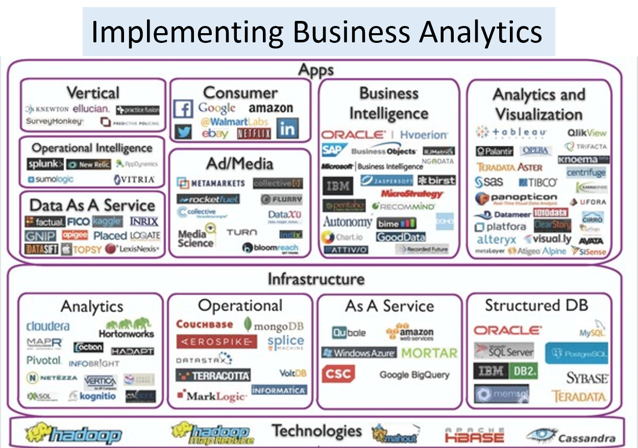
Data Visualization, Discovery and Visual Analytics – Tools, CoE

There are many different ways of telling a story. Data visualization is the use of abstract, non-representational pictures to show numbers by means of the combined use of images, diagrams, animations, points, lines, a coordinate system, numbers, symbols, shading, words, and color-coding. Visualization today has ever-expanding applications in business, science, education, engineering (e.g., product visualization).
A big complaint from business users…. BI platforms and big data today increasingly suffer from poor visualization. Lots of tools, new technology and data but insights are hard to visualize from the background data noise. It’s interesting how in almost every meeting I am in, Data Visualization (and Improving User Experience at even reports/dashboard level), is coming up as key business initiative. There is a growing demand to enable everyday business users to answer questions with ease (self-service visualization).
Data Visualization initiatives tend to have four basic objectives:
- Exploration of the content of a data set (e.g., location-based visualization in mobile applications that helps users complete tasks more instinctively, such as locating a hotel, checking inventory levels, or finding the closest store.)
- Find structure in data (correlations etc.)
- Checking assumptions in statistical models (causation etc.)
- Communicate the results of an analysis in easy to consume way.
The challenge for executives and senior leadership today is – How do we increase the maturity of analytics and visualization area? In a fragmented landscape… how do we benchmark our current state? What structural changes – skillsets, toolsets, mindsets — need to be made to become world-class? How can we drive more business value quicker from all these tool/platform investments?

Better Data Visualization – a Growing Trend
“By visualizing information, we turn it into a landscape that you can explore with your eyes, a sort of information map. And when you’re lost in information, an information map is kind of useful.” — David McCandless TED talk
The expectations of the enterprise users are rapidly shifting forcing BI and application developers to react. The focus is on enabling users to explore and analyze data with simple drag-and-drop operations.
Consumer user experience and engagement are the new standard for enterprise applications. Consumer innovations like iPhone which allow users to utilize drag-and-drop gestures to execute queries, seamlessly shift graphical perspectives on their data and easily answer new questions as their thinking progresses are the new norm.
Improving user engagement around data is a key strategic goal. There is no disputing that organizations increasingly regard their data as a critical strategic resource. The remarkable growth in the volume, diversity and accessibility of digital information creates the potential for people to make more informed, timely and intelligent decisions. Improvements in access, processing, and analytics speed can increase user engagement with data and enhance the range, quality and timeliness of insights that are developed.
Visualization improvements are key to comprehending data volume, velocity and variety. According to IDC, the amount of digital information created, replicated and consumed will grow from 0.8 trillion gigabytes in 2010 to 40 trillion gigabytes in 2020. Many organizations will experience a doubling in the volume of data across their enterprises approximately every 24 months, according to IDC, and are investing heavily to scale their data storage and management platforms to accommodate this growth. These growing volumes of data are also diverse in terms of their source, format and location.

End User Demand for Better Visualization
Reporting -> Scorecards -> Dashboards -> Interactive Visualization -> Analytical Modeling is the demand trajectory in most organizations.
In August 2012, Forrester Research estimated that there will be 615 million information workers globally in 2013 and it predicts that number to grow to 865 million by 2016. Additionally, a Forrester survey of information workers conducted in the fourth quarter of 2012 indicated that only 17% of respondents use a data dashboard or BI tools as part of their job. A significant percentage of information workers are not accessing BI software, and they instead use alternative approaches to meet their analytical needs.
As a consequence of the increasing richness and volume of data, knowledge workers are demanding agile analysis – faster access to information in order to gain insight, solve problems and monitor the performance of their organizations. The growth of cloud computing technologies and the proliferation of connected devices such as tablets and smartphones are enabling users to access information anytime and anyplace.
These trends are accelerating the demand for next generation Visual Analytics and Data Visualizationtechnology, as more information and engagement provokes more questions and fuels demand for more analysis, answers and value. At the same time, advances in user experience driven by consumer technology companies such as Amazon, Apple, Facebook and Google have raised user expectations regarding intuitive, flexible and convenient access to information.
These factors have created a backdrop of growing data resources, increased user appetite for information and rising expectations for accessibility and ease of use. As a result, many organizations are seeking technology that will allow their people to easily access the right information, answer questions, gain insight and share their findings. These organizations are seeking to empower their employees and to unleash their creativity and problem-solving abilities.

Static Reports are Dead
Impactful and engaging visualization is the next frontier.
People within organizations have traditionally accessed data via static reports from enterprise applications and business intelligence platforms maintained by IT departments. These systems, predominantly designed and built in the 1990’s, are generally heavy, complex, inflexible and expensive. As a result, business users are forced to depend on specialized resources to operate, modify and maintain these systems.
The divide between users seeking insight and technical specialists lacking business context introduces inefficiencies and time lags that inhibit the utility and value of these systems. Because most business users lack the time, skills and financial resources necessary to address the limitations of these systems, their adoption has largely been limited to a narrow population of power users with technical expertise and training and to a narrow population of companies.
Faced with these challenges, many knowledge workers today rely on spreadsheets as their primary analytical tool. While spreadsheets are widely available and easier to use than traditional BI platforms, they have a number of limitations. Spreadsheets are not generally designed to facilitate direct and dynamic data access, making the process of importing and updating data manual, cumbersome and error prone. In addition, spreadsheets are not built to accommodate large data sets and offer limited interactive visual capabilities, thereby reducing performance and limiting analytical scope and insight.

“Aggregate -> Explore -> Analyze -> Visualize” Vendors
There are four categories of Data Visualization vendors
- Spreadsheet software providers, such as Microsoft
- Emerging business analytics software companies, such as Tableau Software, Qlik Technologies Inc. and TIBCO Spotfire.
- Enterprise software companies, including suppliers of traditional BI products that provide one or more capabilities that are competitive with our products, such as MicroStrategy, IBM Cognos, Microsoft, Oracle and SAP AG;
- Traditional Statistical vendors like SAS who allow you to do visual analysis… filter, sort, perform aggregations, and summarize;
- and others..
Almost every vendor in the Business Analytics landscape is going after the Data Visualization space as a strategy.
Vendor Focus…Bringing Data to Life
The focus is on allowing users to see and understand data. More effective consumption of data is the target. The four capabilities that are needed to enable easier consumption of data include:
- Self-Service — The simplicity and ease of use of next gen software vendors like Qliktech, Tableau Software or Spotfire gives people the power to access, analyze and share data without the assistance of technical specialists. This self-service capability democratizes access to data, expands the potential user population within organizations and reduces training and support costs.
- Discovery — The human mind is better able to process information, discern trends and identify patterns when presented with information in a visual format. By integrating data analysis and visualization, our software allows people to create powerful visualizations and dashboards that can lead to new discoveries. New capabilities from vendors is designed to seamlessly blend, filter and drill down on information, without the distraction of dialogue boxes, wizards and scripts, allowing users to rapidly and iteratively develop greater insight from their data.
- Speed — Enable people to derive value from their data at an accelerated pace. Due to a growing focus on ease of use and ease of deployment, enterprise users can quickly gain proficiency and generate results rapidly, without the complication, time investment and frustration often associated with traditional BI products.
- Linkage — New software is able to connect directly to a broad range of data sources, enterprise users can perform work without having to undertake complex and time-consuming data movement and transformation.
QLIKVIEWTableau Software | COGNOSSAP BusinessObjects | SAS | EXCEL |
|
|
|
|
| IT Report Authors | Statisticians | Analysts and Consumers |
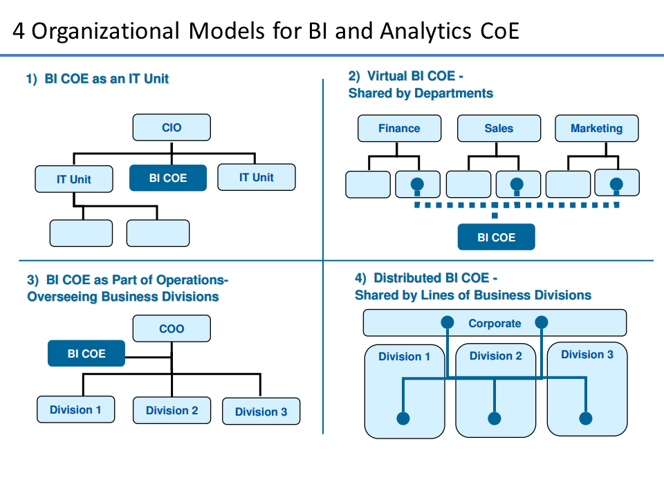
Enabling Better Decision Making via Data Visualization Center of Excellence (CoE)
“How do we create a flexible model for Data Visualization delivery that provides discipline at the core while giving the business the agility that they need to make decisions or meet client needs?”
Decision making is inherently a core business activity. Slow, rigid systems are no longer good enough for business users or the IT teams that support them. Competitive pressures and new sources of data are creating new requirements. Users are demanding the ability to answer their questions quickly and easily.
The challenge for IT and Application Teams in every organization is to deliver exceptional business value to their business partners quickly and consistently while maintaining governance and control. Establishing a Data Visualization Center of Excellence (DVCoE) ensures that the people, process and technology investments are not duplicated and addressed in a way that maximizes ROI and enhances IT-Business partnership.

What is the business imperative being supported by DVCoE?
Reporting | ||
| * | Departmental Reporting | Static and/or parameterized reports built for internal user audiences – less need for pixel-perfect rendering and complex presentation |
| * | Corporate Reporting | Static and/or parameterized reports built for external and executive audiences (including regulatory reports) – pixel perfect and/or complex presentation |
| * | Ad-Hoc Reporting | Query or batch-based data delivery from one-off or custom requests – delivery in data set, spreadsheet or custom report form |
Discovery, Analysis, and Visualization | ||
| * | Business Discovery | Visual exploration of disparate data by business users for the purposes of discovery, what-ifs, scenarios, trending and correlations that are not yet known |
| * | Visualization | Interactive exploration of data by data practitioners, for the purposes of Pre-ETL, Correlation Analysis, Data Profiling, Data Quality, etc… |
| * | Prototyping | Rapid models and interface prototypes to prove out business value and technological fit |
Advanced Analytics | ||
| * | Statistical Analytics | Statistical analysis, trending and reporting – beyond basic statistical analysis. These are statistical/scientific analysis based on advanced modeling. |
| * | Predictive Analytics | Predictive analysis, projections, scenarios and models for future events based on historical data and controllable variables – beyond projections, what-ifs. |
DVCoE — Fundamentals
How can we create a group that will help business see thru the noise of data. While every organization will vary in terms of what business needs they need supported…the basics of any DVCoE are the same. They include Charter, People, Technology Process and Service Management.
Charter and Setup
- Vision -> Establish a guide post
- Executive Sponsorship -> Eliminate roadblocks to change
- Delivery Patterns -> Determine what will be delivered
- Project Intake -> Outline how new work will be accepted
People
- Roles -> Determine what resources are needed
- Team Structure -> Determine who will reside in IT or the business
- Collaboration Process -> Establish guidelines on how work is done and decisions made
- Onboarding Process -> Establish methods for on-boarding new people
Technology Process
- Best Practices -> Document development and UI guidelines
- Delivery Process -> Develop process for application implementation
- Governance Model -> Ensure ongoing environment stability and consistency
Service Management
- Metrics & KPIs -> Quantitatively define success
- Support Model -> Determine who is responsible when help is needed
- Service Level Agreements -> Establish committed SLAs
- Chargeback Model -> Establish mechanism for cost recovery
See my previous post on BI CoE or Competency Centers for a more in-depth discussion.
Sources and References
- http://en.wikipedia.org/wiki/Visual_analytics
- The Visual Display of Quantitative Information by Edward R. Tufte
- Qlikview in the Enterprise – Center of Excellence
- Statistical graphics, also known as graphical techniques, are information graphics in the field of statistics used to visualize quantitative data. Whereas statistics and data analysis procedures generally yield their output in numeric or tabular form, graphical techniques allow such results to be displayed in some sort of pictorial form. They include plots such as scatter plots, histograms, probability plots, spaghetti plots, residual plots, box plots, block plots and biplots …http://en.wikipedia.org/wiki/Statistical_graphics
- Journalism in the Age of Data… http://datajournalism.stanford.edu/
- A great Tumblr blog for visualization examples and inspiration: vizualize.tumblr.com

IoT Links:
Subscribe to:
Posts (Atom)